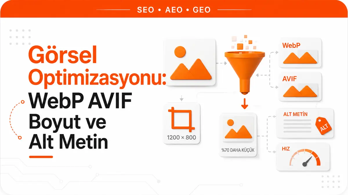
What slows a page down is usually not the text you write but the images you place between the paragraphs. In HTTP Archive's web-wide measurements, images have for years been the single largest component of page weight. Of a median mobile page's total weight of roughly 2 MB, 881 KB came from images alone; in the same measurement, HTML, CSS, JavaScript and fonts combined came in below that figure.
Weight is only half the story. The other half: on roughly 68% of mobile pages, the element that determines Largest Contentful Paint is an image. In other words, the moment a user feels "the page has loaded" is very often the moment they were waiting for a single image to arrive. That is why image optimization is not cosmetic work; it directly determines how fast the page is perceived to be.
Nor is it a single setting. There are four levers that work independently of one another: which format you serve, what size you serve, whether you reserve space for the image in advance, and whether you say in text what the image conveys. The first three work for performance; the last works for accessibility and image search. In practice these four get lumped together, and the weakest link, the file name, gets talked about far more than it deserves, while the strongest links, format and size, get talked about far less.
Which Format for Which Image
Choosing a format is not a race with a single winner. The content of the image determines which compression method will work. In a photo, discarding detail the human eye won't notice is fair game; in a screenshot containing sharp text, the same behavior ruins readability.
| Image type | Preferred format | Fallback | Reasoning |
|---|---|---|---|
| Photo | AVIF | WebP, then JPEG | Lossy compression delivers the biggest gains on photos |
| Image that needs transparency | AVIF or WebP | PNG | Both support an alpha channel and are smaller than PNG |
| Logo, icon, diagram, line chart | SVG | not needed | Vectors stay sharp at any scale and are usually the smallest file |
| Screenshot containing text | Lossless WebP or PNG | PNG | Lossy compression creates artifacts around text edges |
| Short animation | Video or animated WebP | WebP | An animated GIF carries the same content in a much larger file |
Google Search supports the BMP, GIF, JPEG, PNG, WebP, SVG and AVIF formats for images referenced in the src attribute of an img tag. It also recommends that the file name extension match the actual file type; a WebP file with a .jpg extension is an unnecessary source of ambiguity.
Embedding an image in the HTML with Base64 is a separate option. It reduces the number of HTTP requests, but Google's own warning is clear: this method can significantly increase page size. An embedded image also can't be cached separately or served responsively, so it should only be considered for very small assets that repeat on every page.
The Real Difference Between WebP and AVIF
WebP performs lossy compression using predictive coding derived from the VP8 video codec, and it also offers lossless compression by replacing repeated data with shortcuts. According to MDN's average figures, at a visually similar compression level, lossy WebP files are on average 25% to 35% smaller than JPEG, and lossless WebP files are typically 26% smaller than the PNG version of the same image. WebP also supports transparency and animation.
AVIF is a royalty-free format based on the AV1 video codec. It delivers noticeably better compression than PNG and JPEG, and supports higher color depth, animated frames and transparency.
The next part is usually skipped. AVIF provides somewhat better compression than WebP, but it has two real drawbacks: its browser support isn't as deep as WebP's, and it doesn't support progressive rendering. Progressive rendering is how a JPEG first paints a rough version on a slow connection and then sharpens it. AVIF doesn't do this; the image either arrives or it doesn't. For an audience where slow connections are common, this is a trade-off that should be measured in terms of perceived speed.
File sizes in the field support this ranking as well. In the values HTTP Archive measures per format, image sizes at the 90th percentile are as follows:
| Format | Desktop (90th percentile) | Mobile (90th percentile) |
|---|---|---|
| JPG | 274 KB | 266 KB |
| PNG | 196 KB | 207 KB |
| WebP | 116 KB | 107 KB |
| AVIF | 45 KB | 46 KB |
One caveat when reading this table: these are not the same image in four formats. The field measures different images on different sites. Teams that go to the trouble of serving AVIF have usually also fixed their sizing and quality settings, so not all of the difference comes from the codec. The table shows the direction correctly; it does not give an exact conversion ratio. The only way to learn the real gain on your own images is to produce the same source file in both formats with your own settings and compare them.
Serving Formats in Layers With the picture Element
The only safe way to use a modern format is to be able to give the older file to clients that don't support it. The <picture> element exists exactly for this. The browser picks the first supported <source> element in the list and doesn't look at the rest at all:
<picture>
  <source type="image/avif" srcset="/images/sofa.avif">
  <source type="image/webp" srcset="/images/sofa.webp">
  <img src="/images/sofa.jpg"
       alt="Light gray three-seater sofa standing in front of a window"
       width="1200" height="800"
       loading="lazy" decoding="async">
</picture>
There are three things to watch in this structure.
Order matters. The browser stops at the first format it supports, from top to bottom; it doesn't look for the best one. The most efficient format should be at the top. If you put the AVIF line below WebP, even a browser that supports AVIF will download WebP.
The type attribute is required. The browser identifies the format from the MIME type (image/avif, image/webp) and skips a source it doesn't support without downloading it. If type is missing, this filtering can't happen and the fallback chain fails to do its job.
The <img> is not optional. It is both the final fallback and the carrier of the alt, width, height and loading attributes. Google also recommends always specifying a fallback address with src, because some clients may not understand these structures. The <picture> element itself has been widely available in browsers since March 2016, so the need for a fallback stems from support for the format, not for the element.
Serving the Actual Display Size With srcset and sizes
There is one mistake that alone makes the format gain meaningless: placing a 2000-pixel-wide file into a box that takes up 400 pixels on screen. The browser scales the image down for display, but it downloads the full file. This single mistake more than wipes out the percentage you gained by switching to AVIF.
srcset offers the browser a menu of sources to choose from. Two kinds of descriptors can be used, and they are not mixed within the same srcset:
- The
xdescriptor specifies screen pixel density (such as2x). If omitted, the browser assumes 1x. - The
wdescriptor specifies the width of the source in pixels (such as800w), and when used together withsizesit solves both variable layout width and screen density at the same time.
Writing the same descriptor value twice is also invalid. In the field, the w descriptor is used in 62% of srcsets on mobile and x in 15%; the fact that the more powerful one is more widespread is a good sign.
<img src="/images/sofa-800.jpg"
     srcset="/images/sofa-400.jpg 400w,
             /images/sofa-800.jpg 800w,
             /images/sofa-1600.jpg 1600w"
     sizes="(max-width: 600px) 100vw,
            (max-width: 1200px) 50vw,
            600px"
     alt="Light gray three-seater sofa standing in front of a window"
     width="1600" height="1067">
sizes is the part most often written incorrectly. The browser has to choose the image before it has fully applied the CSS, so you are the one telling it how many pixels the image will occupy in the layout. Writing sizes="100vw" for an image that sits 300 pixels wide in a sidebar tells the browser "I'll be as wide as the screen" and leads to the largest file being downloaded. If sizes is wrong, srcset does harm.
Resolution switching or art direction
Two different problems, two different tools:
- If you need different sizes of the same image,
srcsetandsizeson the<img>are enough. - If you need a different crop on a different screen (a wide landscape on desktop, a vertical crop zoomed in on the person on mobile), use
<source>elements withmediaconditions inside<picture>.
Mixing these two up is a common design mistake. If the subject of a wide photo becomes unrecognizable when it shrinks on mobile, the solution is not a smaller file but a different crop.
How width and height Attributes Prevent Layout Shift
Every <img> whose place in the layout depends on its natural size carries the risk of the page being laid out twice: once when the DOM and CSS are processed, and again when the image arrives and its real size becomes known. That second layout is what the user sees as text jumping down the page, and it is one of the most common causes of a poor Cumulative Layout Shift score.
The fix is simple: write the width and height attributes, or reserve the space in advance with CSS aspect-ratio. That way the browser can set aside the right amount of space before the image arrives.
The most common misunderstanding here is this: writing width="1600" does not mean the image will appear 1600 pixels wide on screen. These attributes declare the image's natural size, not its display size. Modern browsers calculate the aspect ratio from these two numbers, so you can keep writing the following rule in your CSS:
img {
  max-width: 100%;
  height: auto;
}
The two work together. The attributes declare the ratio; the CSS handles the responsive behavior. Using only CSS aspect-ratio also reserves space, but if the stylesheet arrives late there's a risk of a brief shift; the attributes come with the HTML, so they take effect earlier.
Despite how cheap this fix is, the field data is striking: on mobile, only 32% of <img> elements have both width and height defined. There has been a four-point improvement over two years, but a two-thirds gap on its own explains why CLS problems are so widespread. We cover the overall role of images in page speed, and how it translates to LCP, in detail in our guide to getting LCP under 2.5 seconds.
Who Reads Alt Text and How to Write It
Alt text has three separate readers, and all three want the same thing: not what the image is, but what it conveys.
People using screen readers. For a user who can't see the image, the alt text is the content that replaces it. If an informative image has no alt text, that information simply doesn't exist on the page for that user.
Google. Google's own documentation describes alt text as the most important way to provide additional metadata about an image. Google uses alt text, computer vision algorithms and the page's content together to understand what an image is about. When an image is used as a link, its alt text can also act as anchor text.
AI systems that read the page as text. This third reader is relatively new and the most neglected. When a generative AI system processes your page, it doesn't see the image itself; it sees the surrounding text and the alt attribute. If a chart carries your argument and its alt text is "chart", that argument never existed in the text layer at all.
Good and bad alt text
The rule can be summed up in one sentence: specificity beats keyword presence. Google explicitly warns against stuffing alt attributes with keywords, saying it creates a poor user experience and can make a site look like spam.
| Image | Weak | Good |
|---|---|---|
| Product photo | alt="sofa" | alt="Light gray linen-upholstered three-seater sofa with wooden legs" |
| Line chart | alt="chart" | alt="Line chart showing organic traffic rising from 12,000 to 31,000 over six months" |
| Logo link | alt="logo" | alt="Go to home page" |
| Screenshot | alt="screenshot seo tool analysis report" | alt="Search Console performance report with a query filter applied" |
| Decorative divider | alt="pattern" | alt="" |
The last row is especially important. The alt attribute of a decorative image is left empty, not removed. An empty alt="" tells the screen reader "skip this" and doesn't disrupt the user's flow. If the attribute is missing altogether, some screen readers fall back to reading the file name, pouring a string like IMG-20240412-093311.jpg into the user's ear.
There is no fixed length limit; write as much as it takes to describe the image's function. Openings like "image of", "picture of" or "photo of" are unnecessary, because the screen reader already announces that the element is an image. Inline <svg> elements have no alt attribute; instead, a <title> element connected with aria-labelledby is used.
The situation in the field isn't encouraging here either. Only 55% of <img> elements have a non-empty alt attribute, which means 45% have none. On top of that, a significant share of those that do have one carry only a file name or meaningless short strings. The improvement recorded over two years is one point.
What File Names Actually Contribute
This topic is usually made out to be bigger than it is, so let's start with Google's own wording: a file name can give Google very light clues about the subject of an image. That is the entire claim. It is a real contribution, but a small one, and it isn't magic.
Since doing it right is cheap anyway, it's worth doing:
- Use short but descriptive names:
gray-linen-sofa.jpginstead ofIMG00023.JPG. - Avoid generic names like
image1.jpg,pic.gifor1.jpg. - Separate words with hyphens and use lowercase.
- Avoid non-ASCII characters (on Turkish sites, for example, letters like
ş,ğ,ı,ö,üandç). Names containing them turn into percent-encoded strings in the URL and become unreadable. If you must use characters outside the Latin alphabet, follow URL encoding guidelines. - On sites with thousands of images, consider automating naming.
What really matters, though, is what not to do. Bulk-renaming existing images is a URL change. For an image that ranks in image search or receives external links, this means taking a real risk for a very small gain. The sensible order is this: newly uploaded images go in with the right name, and for existing images, fix the alt text instead of touching the file name. The contribution of alt text is incomparably larger anyway.
Setting Compression Levels in Practice
There is no single quality number that fits everyone, because the content of the image determines where degradation will show. Noisy, detailed photos hide aggressive compression; flat gradients, large single-color areas and sharp text edges are the first places to break down.
The method that works is this: produce the same source file at several quality levels and compare them at the size the image will actually appear on the page. Zooming into the file at 100% on a high-resolution screen and then displaying that image 400 pixels wide on the page is the easiest way to waste bytes. The lowest setting at which you can't see a difference at that size is the right setting.
A few more practical rules:
- Use lossless compression only when exact reproduction is required: screenshots with text, line art and files that will be edited again later.
- Don't re-encode a file that has already been lossy-compressed over and over. Each round accumulates quality loss. Generate all derivatives from the original master file.
- Strip embedded metadata you don't need. Color profiles can take up a surprising amount of space; modern formats can carry the same color space information with a four-byte signal.
- Compression has a floor as well as a ceiling. Google notes that high-quality photos appeal to users more than blurry images, and that sharp images look more attractive in result thumbnails and can increase the likelihood of getting traffic. Making an image unrecognizable while chasing bytes is a net loss.
Page-Level Requirements for Visibility in Google Images
Visibility in image search isn't just about the properties of the image file. Google extracts information about an image's subject from the content of the page, including captions and image titles. In practical terms: place the image near text related to the topic and publish it on a page that is relevant to the image's subject. An image with the right alt text won't perform as expected on a page unrelated to its topic.
Other page-level requirements:
- Captions and surrounding text. The descriptive line directly beneath the image complements the alt text for both users and classification.
- Structured data. For types such as products, recipes and videos, the
imagefield is required to be eligible for badges and rich results in Google Images. Structured data is useful for classic search features; it cannot be presented as a guarantee of being cited in AI answers. - CDN ownership. If you serve images through a CDN, verify ownership of the CDN domain in Search Console; otherwise crawl errors on that domain won't be reported to you.
- Repeated images. If the same image is referenced from many pages of a large site, review your caching configuration so Google doesn't need to request the same file over and over.
Product images are the busiest intersection of all this. The same image works for conversion, image search and structured data at once; we cover the commercial payoff of image discipline on category and product pages separately in our e-commerce SEO guide.
Loading Order and Its Relationship to LCP
The final step in optimizing an image is telling the browser when to download it. loading="lazy" is the right tool for images below the fold: they aren't downloaded on the initial load, which reduces the number of resources competing for LCP.
There is one exception, and it is critical: never lazy-load the LCP image. Delaying the largest visible element on the page delays LCP by definition. Field data shows how common this mistake is: on mobile, 9.5% of the <img> elements responsible for LCP use native lazy loading. HTTP Archive describes this outright as an anti-pattern that makes pages much slower.
The correct setup breaks down like this:
- LCP image: no
loading="lazy",fetchpriority="high"set, and early discovery via<link rel="preload">if needed. - Images below the fold:
loading="lazy"anddecoding="async". - Single resource rule: preload is used only for the single most critical image. Prioritizing several resources makes them compete with each other and can delay LCP.
The loading order of images can't be considered separately from the page's overall render chain. We explain the management of render-blocking resources and the full deferred loading strategy in our guide to inlining critical CSS.
Which Step to Do First
All of the sections above are correct, but they don't carry equal weight. When we combine the size of the impact with how often each fix is actually applied in the field, a sensible order emerges. The priority below is not an algorithm rule; it is a judgment drawn from where impact and the rate of neglect intersect:
| Order | Task | What it fixes | Adoption in the field |
|---|---|---|---|
| 1 | Removing lazy loading from the LCP image | LCP | 9.5% of LCP images are still lazy-loaded |
| 2 | Adding width and height | CLS | Present on only 32% of images |
| 3 | Setting up an AVIF and WebP fallback chain | Bytes and LCP | On the median page, most bytes still come from JPEG |
| 4 | Correct sizing with srcset and sizes | Bytes and LCP | 42% of mobile pages use srcset |
| 5 | Writing meaningful alt text | Accessibility and image search | 45% of images have no alt text |
| 6 | Descriptive file names for new images | Small classification contribution | Cheap but limited impact |
The first two steps are one-line jobs in the code and directly affect measurable metrics. The third and fourth steps require building a production pipeline, because producing three formats and three sizes by hand isn't sustainable; this work should be handed off to an image processing layer or a CDN. The fifth step isn't a one-time technical task but a content production habit. The sixth step applies only to new files and isn't worth chasing for existing ones.
Frequently Asked Questions
Can I delete my JPEG files once I start serving AVIF?
No. The <img src> file, the bottom step of the <picture> fallback chain, is the only address seen by clients that don't support modern formats and by some third-party tools. Deleting the fallback removes the very reason the chain exists.
Will switching to WebP break my existing image URLs?
That depends entirely on the method. If you delete the old file and replace it with a file that has a new extension, yes, the URL changes and the accumulated value of that image is put at risk. With the <picture> approach, the existing src address is left untouched and new <source> lines are added on top. The latter is the low-risk route and preserves the image's current position in image search.
My CMS converts images to WebP automatically. Do I need to do anything else?
Yes. Automatic conversion only pulls the format lever. Serving the image at its actual display size, writing the width and height attributes correctly, making the sizes value match the layout and making the alt text meaningful are still your responsibility. Format is the most visible lever, but it isn't the only one.
Is alt text the same as the title attribute?
No. The title attribute is tooltip text that appears on mouse hover; it doesn't appear reliably on touch devices and doesn't replace alt text. The attribute that matters for accessibility and image search is alt. Writing a title doesn't make up for a missing alt.
Does embedding images in HTML with Base64 improve performance?
Sometimes, but only in a narrow case. It reduces the number of HTTP requests; on the other hand, as Google also points out, it can significantly increase page size. An embedded image also can't be held independently in the browser cache, can't be sized with srcset, and bloats the HTML on every request. It's only worth considering for icons of a few hundred bytes that repeat on every page.
What should the upper limit be for image file size?
Giving a single correct number would be misleading, because the image's function determines the limit. The meaningful reference is the distribution observed in the field: at the 90th percentile by format, JPEG files are around 270 KB while AVIF files stay around 45 KB. If your above-the-fold image that determines LCP sits at the top end of this distribution, that is a measurable speed cost. Set your target not as an absolute number but according to the role that image plays on the page.