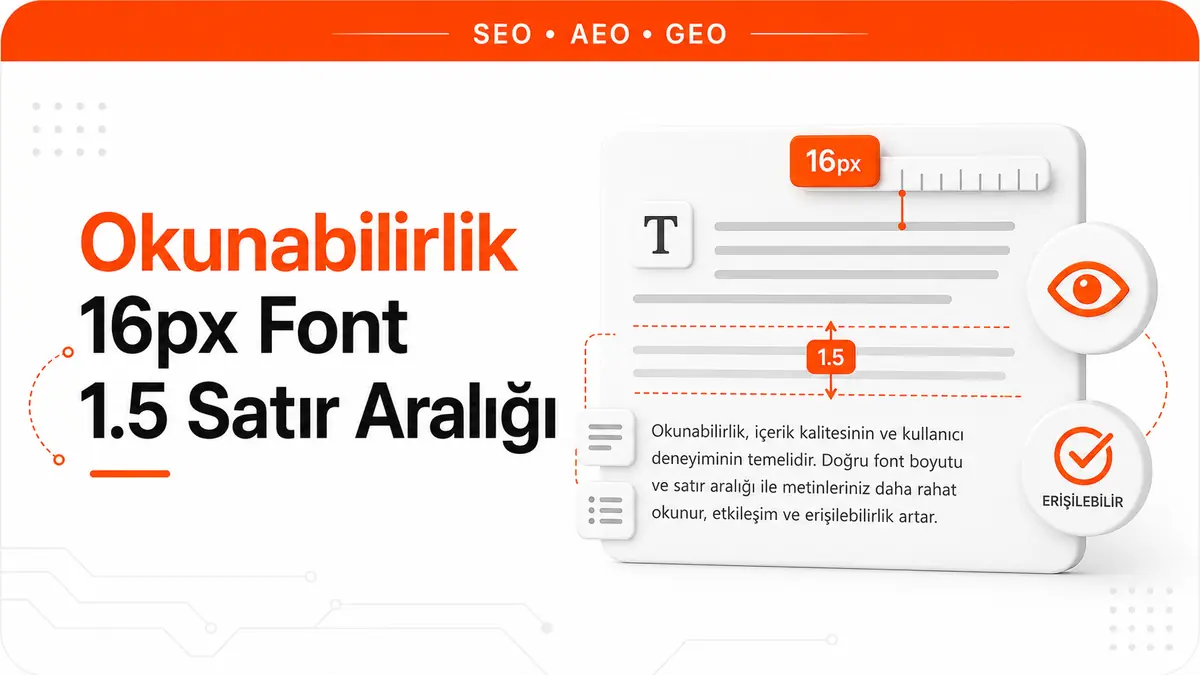
Mobile readability is a UX metric that describes how well users can take in on-screen text without cognitive strain. A small body font forces mobile users to zoom, slows reading down and makes it easier to leave the page early. That is why typography choices directly shape a page's user experience.
Default Browser Font Size and the 16 Pixel Reference
All modern browsers apply a default body font size of 16 pixels. No standard makes this value mandatory; it has simply been the shared browser default for a long time. Google's web developer guidance also recommends 16 CSS pixels as the base size for body text on mobile pages.
When html { font-size: 100% } is defined in CSS, the browser converts this value to 16 pixels. The rem unit is also tied to this root value. The equation 1rem = 16px is therefore the basic building block of the entire typography system. Projects that change the root font size to 14 or 12 pixels break every rem-based calculation and fall below the readability threshold.
The Mobile SEO Impact of Fonts Smaller Than 16 Pixels
Search Console's Mobile Usability report, along with its "Text too small to read" warning, was retired in December 2023. Today the same check is done by Lighthouse's legible font sizes audit, which fails when more than 40 percent of the text on a page is smaller than 12 CSS pixels. A small font does not get a page dropped from the index and is not a direct ranking penalty; its impact comes through mobile users who cannot read the text and leave.
The audit's threshold is 12 pixels. Values between 12 and 16 pixels do not produce a warning, but they still make reading harder on mobile. Not letting the body font drop below 16 pixels is therefore the safe default.
Line Height and the Technical Rationale for the 1.5 Ratio
Line height determines the vertical distance between the baselines of two consecutive lines of text. In CSS, line-height: 1.5 applies a line height of 1.5 times the font size. With a 16 pixel font size, this corresponds to a line height of 24 pixels.
WCAG 2.2 Success Criterion 1.4.12 (Text Spacing, level AA) does not require a design to use 1.5 line height. What it requires is this: when a user raises line height to at least 1.5 times the font size and paragraph spacing to 2 times, no content may be clipped or overlap. A line height of 1.2 does not violate the criterion on its own; the violation happens when fixed-height boxes cut off the enlarged text. The 1.5 ratio is the value WCAG gives for line spacing within paragraphs in criterion 1.4.8 (AAA), and it is the safe default for readability in long body text.
The Mathematical Balance Between Font Size and Line Height
In typography engineering, the ideal line height ratio decreases as font size increases. For a 16 pixel body font, a ratio of 1.5 is the right balance point. For a 24 pixel heading, a ratio of 1.3 is enough. This inverse relationship shows that with large fonts, the space between lines should be proportionally smaller.
To build this balance in CSS, set up a system of line height variables:
:root {
  --body-line-height: 1.5;
  --h1-line-height: 1.2;
  --h2-line-height: 1.3;
  --h3-line-height: 1.35;
}

body { font-size: 16px; line-height: var(--body-line-height); }
h1 { line-height: var(--h1-line-height); }
h2 { line-height: var(--h2-line-height); }
h3 { line-height: var(--h3-line-height); }
This structure preserves the visual rhythm between headings and body text and maximizes reading comfort at every level.
Paragraph Width and Character Count Limits
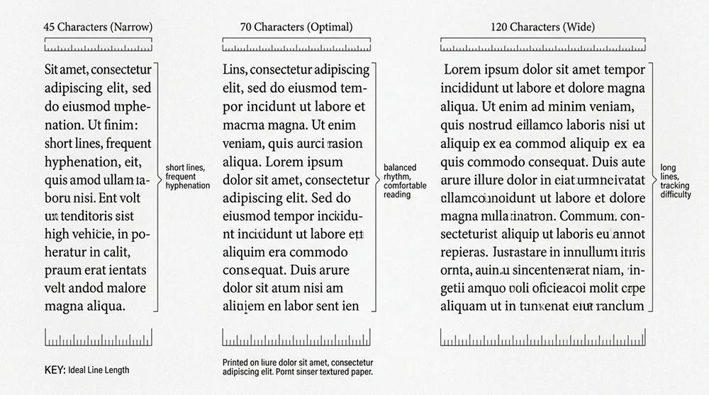
The ideal number of characters per line is between 45 and 75. This range keeps the human eye from losing its focus point when it returns from the end of a line to the start of the next. On mobile screens, width is physically limited. On desktop, however, full-width text blocks can exceed 120 characters per line, and reading speed drops.
In CSS, max-width: 70ch limits the text block to a width of roughly 70 characters. The ch unit is calculated based on the width of the "0" character in the font being used. Applying this rule to the container element that holds the body text guarantees an optimal line length on desktop and tablet screens.
Horizontal Padding on Mobile Screens and Readability
On mobile devices, text blocks that hug the edges of the screen seriously reduce readability. The eye needs margins to perceive where a line begins and ends. A minimum of 16 pixels of horizontal padding creates enough breathing room between the text and the edge of the screen.
On the CSS side, padding-inline: 16px provides this space. To increase the padding on wider screens, use the clamp function: padding-inline: clamp(16px, 4vw, 48px). This formula applies 16 pixels of space on a 375 pixel screen and 48 pixels on a 1200 pixel screen, with a seamless transition in between.
Contrast Ratio and Its Link to Readability
Even if font size and line height are set correctly, a low contrast ratio makes text unreadable. WCAG 2.2 requires a minimum contrast ratio of 4.5:1 for normal text. This ratio applies to body fonts of 16 pixels and above. For text above 24 pixels, or bold text above 18.66 pixels, the threshold drops to 3:1.
Chrome DevTools shows the contrast ratio automatically next to the color information when you hover over an element. When insufficient contrast is detected, clicking the "Aa" icon gives you the nearest WCAG-compliant color value suggested by DevTools. This feature grounds color discussions with the design team in concrete data.
System Font Stack and Loading Performance
The delay while custom font files (WOFF2) load keeps text from appearing on screen or causes a flash of invisible text (FOIT). Using a system font stack reduces this delay to zero, because the operating system's built-in fonts are instantly available.
body {
  font-family: -apple-system, BlinkMacSystemFont, "Segoe UI",
               Roboto, Oxygen, Ubuntu, Cantarell, sans-serif;
  font-size: 16px;
  line-height: 1.5;
}
This declaration selects the most legible native font on every operating system. When a custom font is necessary for brand identity, adding font-display: swap shows the text in the system font during loading and swaps it once the custom font is ready. This keeps the LCP metric intact.
Font-Display Swap and Text Visibility Timing
The font-display property determines how the browser displays text while a custom font file is downloading. The swap value shows the fallback font until the font loads, so the user starts reading the text immediately. The block value, by contrast, waits for the font for 3 seconds, and the text stays invisible during that time.
From a readability standpoint, font-display: swap is the only right choice. Adding this declaration to the @font-face block is enough:
@font-face {
  font-family: 'CustomFont';
  src: url('/fonts/custom.woff2') format('woff2');
  font-display: swap;
}
The browser first renders the system font, then transitions smoothly once the custom font is ready. This approach keeps CLS under control and spares the user a blank screen.
Fluid Typography and Using the Clamp Function
Fixed font sizes cause problems across different screen widths. While 16 pixels is enough on a phone, it looks small on a 27-inch monitor. Fluid typography scales font size smoothly according to screen width.
The CSS clamp() function defines this scaling in a single line:
body {
  font-size: clamp(1rem, 0.875rem + 0.5vw, 1.25rem);
  line-height: 1.5;
}
This formula applies a font size of 16 pixels on the narrowest screen and 20 pixels on the widest. In between, the size scales linearly with viewport width. The clamp function guarantees that the minimum value never drops below 1rem (16px), and the readability threshold is preserved at every screen size.
Heading Hierarchy and Visual Weight Balance
There should be a consistent size ratio between heading levels from H1 to H6. In typography theory, this ratio is called a "type scale". A ratio of 1.250 (Major Third) produces a balanced hierarchy for readability-focused projects.
When this ratio is applied with a base size of 16 pixels, H1 becomes about 31 pixels, H2 about 25 pixels and H3 about 20 pixels. The difference between each level lets the user grasp the heading hierarchy visually at a glance. When the difference is too small (for example, only 2 pixels between H2 and H3), the hierarchy becomes unclear and the scanning experience breaks down.
Optimizing Paragraph Spacing (Margin-Bottom)
The space between paragraphs lets the text "breathe", independently of line height. Insufficient paragraph spacing makes text blocks look like a solid wall. Too much space, on the other hand, breaks the contextual connection between pieces of content.
Optimal paragraph spacing is between roughly 75 percent and 100 percent of the line height in use. With a 16 pixel font and 1.5 line height, this range corresponds to 18 to 24 pixels. In CSS, p { margin-bottom: 1.25em } produces a 20 pixel gap, and this value hits the right balance point in most design systems.
Expert Note: The Detail Everyone Overlooks
Here is the point that looks right in theory but falls apart in practice: even if font size and line height are set correctly, all the typography work is wasted when the contrast between text color and background color is insufficient. Many designers use a light gray (#999 or #aaa) text color to look "stylish". This color produces a contrast ratio of 2.8:1 on a white background and falls far below the WCAG threshold. The most common readability issue found in field audits is not font size but insufficient contrast. On a white background, the lightest acceptable body text color is #767676 (4.5:1 contrast); not going any lighter than that is the foundation of typography optimization. Debating font size before fixing contrast is like planning the roof of a building whose foundation has not been laid.
Letter-Spacing and Word-Spacing Settings
The space between letters (letter-spacing) affects readability as much as font size. The default letter spacing is sufficient for most font families. On large headings, however, applying negative letter-spacing gives a compact, professional look. In body text, letter-spacing should not be changed.
WCAG 2.2 Success Criterion 1.4.12 requires that users be able to increase letter spacing to at least 0.12em. To meet this criterion, the text container must use a flexible width rather than a fixed width. In fixed-width boxes, text overflows and content is lost when letter spacing is increased. overflow: visible or the flexible box model prevents this problem.
Dark Mode and Readability Parameters
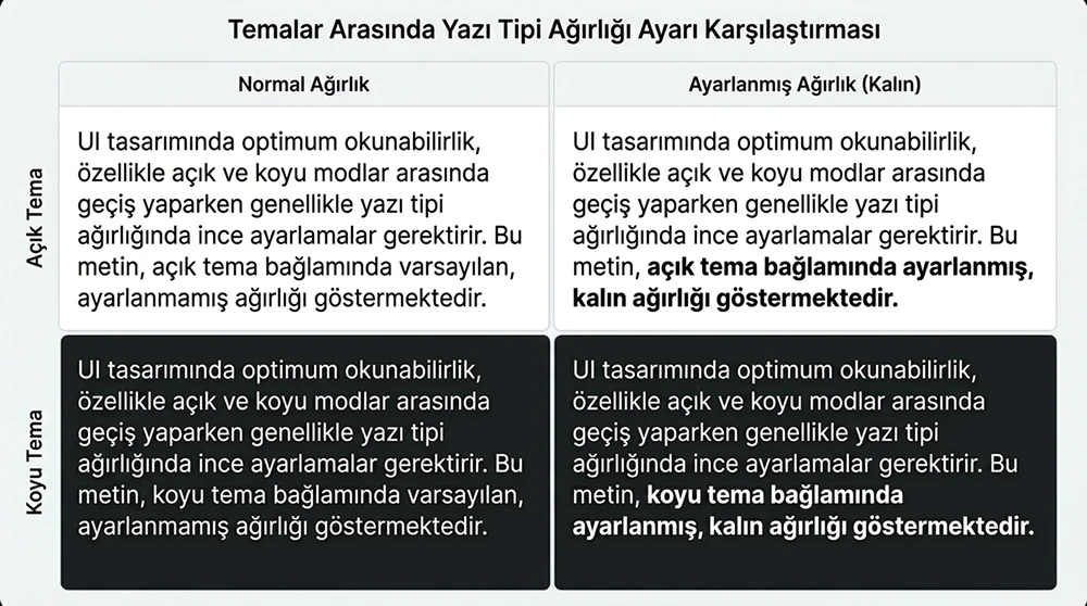
As of 2026, more than 40 percent of users prefer dark mode. The human eye behaves differently when reading light text on a dark background. Bright text looks bolder on a dark background (the halation effect). This effect makes normal-weight fonts feel heavier in dark mode.
Detecting dark mode with the CSS prefers-color-scheme media query and reducing the font weight by 50 to 100 units restores this balance:
@media (prefers-color-scheme: dark) {
  body {
    font-weight: 350;
    -webkit-font-smoothing: antialiased;
  }
}
The -webkit-font-smoothing: antialiased declaration improves anti-aliasing on dark backgrounds. This two-line addition noticeably improves reading comfort in dark mode.
The Viewport Meta Tag and Controlling Font Scaling
To prevent mobile browsers from automatically enlarging text, the viewport meta tag must be configured correctly. The declaration <meta name="viewport" content="width=device-width, initial-scale=1"> disables the browser's own scaling algorithm and ensures the font sizes defined in CSS are applied exactly.
A critical mistake is adding the maximum-scale=1 or user-scalable=no parameters. These parameters prevent users from zooming in on text and violate WCAG Success Criterion 1.4.4. In accessibility audits, this declaration is flagged as a "serious error". The viewport meta tag should use only width=device-width, initial-scale=1, with no scaling restrictions added.
Techniques for Reducing Reading Fatigue in Long-Form Content
In content longer than 3,000 words, reading fatigue builds up even with good typography settings. Add visual break points to break up the wall-of-text effect. Elements such as blockquotes, images, code blocks or highlighted statistic boxes change the rhythm of the text and refresh the reader's attention.
On the CSS side, applying a different typography profile to the blockquote element creates an effective break:
blockquote {
  font-size: 1.125rem;
  line-height: 1.6;
  border-left: 3px solid currentColor;
  padding-left: 1.25rem;
  margin-block: 2rem;
}
This declaration visually separates the quote block from the body text and resets the reader's rhythm. In long text, visual breaks like these give the eye a rest and make it easier for the reader to keep going.
Web Font Size Optimization and the Subset Technique
The size of custom font files directly affects load time. A full WOFF2 file that includes Turkish characters weighs 80 to 150 KB. Subsetting the file to only the character range in use brings it down to 20 to 35 KB.
A subset is applied with the unicode-range declaration in the @font-face block:
@font-face {
  font-family: 'CustomFont';
  src: url('/fonts/custom-latin-tr.woff2') format('woff2');
  unicode-range: U+0000-00FF, U+011E-011F, U+0130-0131,
                 U+015E-015F, U+00C7, U+00E7, U+00D6, U+00F6,
                 U+00DC, U+00FC;
  font-display: swap;
}
This declaration covers the basic Latin character set and the letters specific to Turkish (ğ, ı, ş, ç, ö, ü). Arabic, Cyrillic or Chinese character blocks are not included in the file, which removes unnecessary file weight.
CLS Impact and Layout Shift During Font Loading
When a font file loads, the switch from the fallback font to the custom font changes the size of the text block and triggers Cumulative Layout Shift (CLS). The metric differences between the fallback font and the custom font (ascender, descender, line gap) determine the size of this shift.
In the CSS @font-face block, the size-adjust, ascent-override and descent-override properties bring the fallback font's metrics closer to the custom font:
@font-face {
  font-family: 'Fallback';
  src: local('Arial');
  size-adjust: 104%;
  ascent-override: 90%;
  descent-override: 22%;
  line-gap-override: 0%;
}

body {
  font-family: 'CustomFont', 'Fallback', sans-serif;
}
This metric matching reduces layout shift during the font switch to almost zero. To keep CLS below 0.1, the font metric override technique is a mandatory optimization step.
Using REM and EM Units Correctly for Readability
The pixel unit defines a fixed size and ignores the user's font size preference in browser settings. From an accessibility standpoint, this behavior is unacceptable. The rem unit is tied to the root font size, and the em unit to the font size of the parent element.
Using rem for the body font size and em for nested components is the right approach. The body { font-size: 1rem } declaration preserves the browser's default 16 pixel value, and when the user increases the font size in browser settings, all text scales proportionally. Using pixels for the body font overrides the zoom preference of visually impaired users and constitutes an accessibility violation.
A Typography Audit Protocol with Lighthouse and axe-core
Use Lighthouse and axe-core together to audit readability parameters in bulk. Lighthouse runs font size, contrast and tap target checks in its "Accessibility" category. axe-core tests text spacing, heading hierarchy and color contrast rules specifically against WCAG criteria.
Running both tools in sequence from the command line produces a comprehensive typography audit report:
npx lighthouse https://site.com --only-categories=accessibility --output=json > lh-report.json
npx axe-core https://site.com --rules=color-contrast,text-spacing > axe-report.json
Combining both reports provides the basis for building a prioritized list of fixes. Integrated into the CI/CD pipeline, this setup catches typography regressions automatically on every deployment.
Measuring Readability Scores and the Turkish Adaptation of Flesch-Kincaid
Typographic readability is not limited to visual parameters. The linguistic complexity of the text also shapes the reading experience. The Flesch-Kincaid readability formula was developed for English. Because syllable counts and sentence lengths are distributed differently in Turkish texts, applying it directly gives misleading results.
Atatürk University's study on a Turkish readability index recommends keeping average sentence length between 12 and 17 words for Turkish. Three to five sentences per paragraph and a single main idea per sentence produce the optimal readability score for Turkish web content. When these parameters are evaluated together with typography settings, they form a holistic readability engineering framework.
A Complete CSS Template for Readability Parameters
The most efficient way to standardize readability settings that repeat from project to project is to create a global CSS template:
:root {
  --font-base: clamp(1rem, 0.875rem + 0.5vw, 1.25rem);
  --line-height-body: 1.5;
  --line-height-heading: 1.25;
  --max-content-width: 70ch;
  --paragraph-spacing: 1.25em;
  --min-contrast: 4.5;
}

body {
  font-size: var(--font-base);
  line-height: var(--line-height-body);
  -webkit-font-smoothing: antialiased;
  text-rendering: optimizeLegibility;
}

article, .content {
  max-width: var(--max-content-width);
  margin-inline: auto;
  padding-inline: clamp(16px, 4vw, 48px);
}

p { margin-bottom: var(--paragraph-spacing); }
h1, h2, h3, h4, h5, h6 { line-height: var(--line-height-heading); }
This template manages all readability parameters through CSS custom properties. For project-specific changes, you only update the root variables, and consistency stays intact.