Why doesn't a full report lead to decisions?
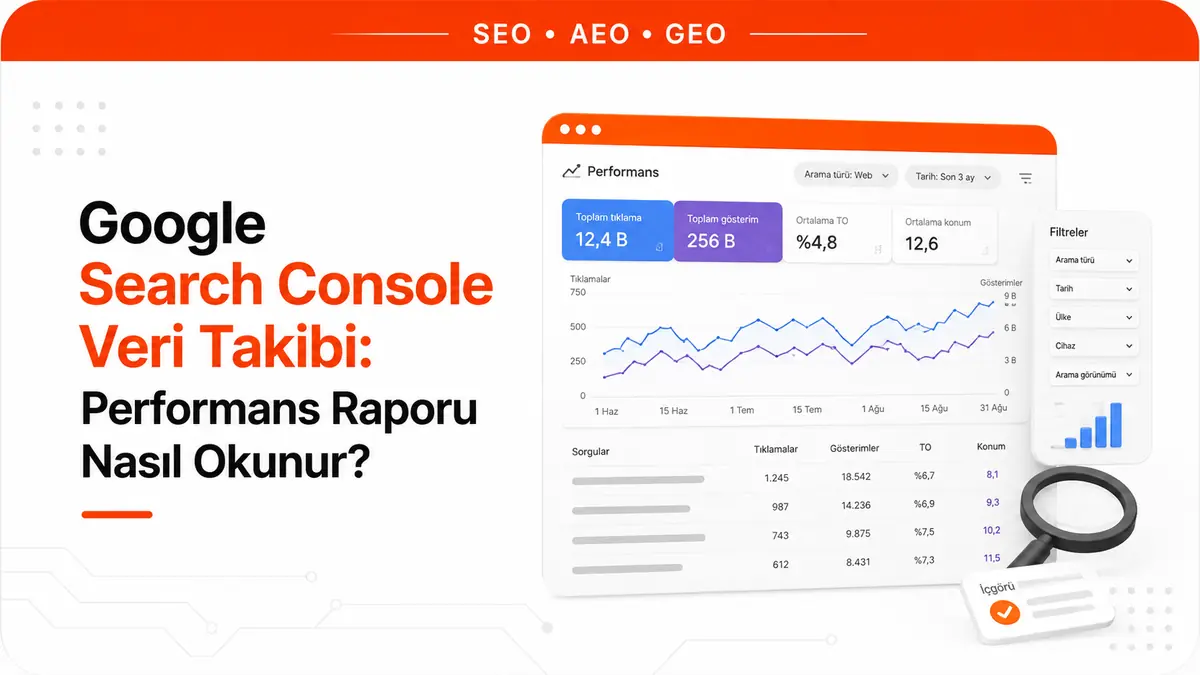
The Search Console dashboard never lacks data: four metrics, six dimensions and sixteen months of history are ready and waiting. The problem is not a shortage of numbers but that three of the four do not measure what they appear to measure. Clicks are a straight count. Impressions are a conditional event count. Click-through rate, as the ratio of the two, inherits the flaws of both, and average position is an average of averages. That is why a number in the report can move without anything changing on the site.
Google defines them as follows: clicks are the number of times users clicked through to your site from search results. Impressions are the number of times your site appeared in search results. Click-through rate (CTR) is clicks divided by impressions. Average position is the average position of your site's topmost result.
These four metrics are grouped into six dimensions: queries, pages, countries, devices, search appearance and dates. The search type filter separates web, image, video and news results. The report shows the last three months by default, and the date filter widens the window. This is exactly where reading discipline begins: the dimension you choose changes how the number is aggregated.
Why isn't average position your ranking?
Average position is the average of your site's topmost position in search results across all the queries you appeared for. Google's own example makes the measurement clear: if your pages rank 2nd, 4th and 6th for one query, the position for that query counts as 2; if you rank 3rd, 5th and 9th for another query, the position counts as 3. The average of the two queries is 2.5.
The rule that really matters comes next: for a link's position to be recorded, it must have received an impression. If a result did not get an impression, for example it sits on page three but the user only viewed the first page, no position is recorded for that query at all. So average position is not the average of all your rankings; it is the average only of the queries you were seen for.
Most reports read the practical consequence backwards. An improving average position may not mean you moved up: if you lost impressions on queries where you ranked deep, the poor positions drop out of the calculation and the number improves on its own. The reverse is also true; when you start appearing at low positions for new queries, average position gets worse, even though what is happening is growth.
So never read average position alone; read it alongside impressions. If position is getting worse while impressions rise, you have entered new query territory. If position is improving while impressions fall, your visibility surface has shrunk and the improvement is only cosmetic.
The value in the chart and the value in the table do not answer the same question either. The number you see in the chart belongs to your whole site's topmost result; the number in the table belongs to the URL or grouping dimension in that row. Looking for a single site-wide "our position" is therefore meaningless.
When does an impression count and when doesn't it?
An impression is recorded when a user sees, or may have seen, a link to your site in Search, Discover or News. The general rule: if the result is on the current results page, it counts as an impression even if the user did not scroll down to it, as long as the user does not have to click to see more results.
The rule does not work the same way for every result type, and this is where the misunderstanding starts. In components that scroll or expand internally, such as a results carousel or an expandable FAQ result, the item must become visible within the carousel or be clicked open to count as an impression. On infinite-scroll surfaces without pagination (mobile image search, a Discover card), the item must be scrolled into view. Scrolling away and back within the same query or session does not produce a second impression.
If a single search element contains multiple links, the count changes depending on the grouping you choose. In Google's knowledge panel example, if the same panel links to five different pages, one impression in total is recorded when grouped by property; when grouped by page, each of the five pages gets one impression.
The reading rule that follows is clear: impressions are not "how many people saw you". They are a visibility event whose counting rule changes by result type. Putting the impressions of a query set dominated by carousels and rich results next to a set dominated by plain links means comparing two different counting rules.
Finding opportunities in the impressions, position and CTR triangle
The three numbers say nothing on their own; the mismatch between them does. Opportunity lies in the rows where the three do not line up.
| Pattern in the report | Likely meaning | First move |
|---|---|---|
| High impressions + low CTR + first-page position | You appear in the results, but users skip you | Title and description text |
| High impressions + low CTR + second-page position | Not a title problem; CTR is naturally low at that depth | How deeply the content answers the query |
| Low impressions + high CTR | You answer the query well but rarely appear | Topic coverage and the page's visibility |
| Impressions rising + clicks flat | You are appearing at low positions for new queries | Separate out which queries they are |
Reading position bands calls for special care. Queries between positions five and fifteen are the zone where your page is already considered suitable for the query but users mostly settle for the results above. The value of this band is not a promise of a fixed increase in clicks but the nature of the work: working on a query where demand is proven and your site already appears is a shortcut compared with creating a page from scratch.
The comparison baseline also matters when interpreting CTR. A query's CTR depends on how its results page is built; for a query with rich results, a map or an answer box above, the same position produces noticeably fewer clicks. That is why you should compare a query's CTR with your own site's queries at similar positions, not with a generic industry table.
The report gives you the symptom, not the diagnosis. A "high impressions, low clicks" row does not tell you whether the problem is in the title or the content; for that you need to look at the page itself. This is exactly the stage where an on-page SEO analysis tool helps, giving you a quick page-level view of titles, descriptions and content.
Why don't the Queries tab and the Pages tab match?
Trying to reconcile the totals of the two tabs is the biggest time sink in the report, because they use different aggregation rules. Data in the queries, countries, devices and dates dimensions is aggregated by property. Data in the pages and search appearance dimensions is aggregated by page.
The difference shows up when the same search element contains multiple links from your site: at property level this is one impression, while at page level each page gets its own impression. That is why, when you add a page or search appearance filter, the chart and table totals can diverge, and the total clicks and impressions in the chart can even go up.
The right question is not "why don't these numbers add up" but "which aggregation answers my question". Property-level aggregation answers "how is the site performing for this query". Page-level aggregation answers "how is this URL performing". Merging the two into one table and looking for the difference means mistaking two different measurements for the same one.
How many of your pages compete for the same query?
Linking the query dimension to the page dimension is the least used but most useful reading in the report. When you filter for a single query and switch to the Pages tab, you see every URL that received impressions for that query.
If impressions are concentrated on a single URL, Google sees a clear answer page on your site for that query. If impressions are spread across several URLs and none dominates, the table is telling you that your site has no single page that stands out as the answer to that query. This is not evidence of a penalty; it points to diluted matching. If the pages genuinely serve different intents, the spread is normal; if they repeat the same intent, merging or differentiating them becomes an option.
The same reading works in reverse. When you filter for a single page and switch to the Queries tab, you see which set of queries the page matches. A page getting impressions for queries you did not target is signaling that its positioning has drifted from the intent you built it for.
Do not use this reading for precise arithmetic. Because the query dimension is aggregated by property and the page dimension by page, the distribution you see shows direction, not an exact share.
The query table is not all of your site's queries
The query table is a sample, not a count; any calculation made without knowing this comes out wrong. Three separate mechanisms trim the table.
- Anonymized queries: Some queries are removed from the report to protect user privacy. They do not appear in the table, but they are included in the chart totals until a query filter is applied.
- Row limit: The table shows at most 1,000 rows. Rare, long-tail rows drop out of the table but stay in the chart total.
- Data truncation: Search Console stores and shows only the most important data rows. For a more complete query list, use the bulk data export.
The most misleading consequence is this: when you apply a page or query filter, the "matching" and "not matching" totals may not equal the unfiltered total. Anonymized queries and data truncation account for the gap.
The practical effect shows up when separating branded traffic. Isolating non-branded performance with a "Query doesn't contain" filter set to your brand name shows the trend correctly, but the resulting number is not the exact value of non-branded organic traffic. Use this filter to read direction; do not put it in a client-facing report as a precise figure.
The most common trap in period comparisons
You turn on comparison with the Compare option in the filter box, which adds a Difference column to the table. The trap is placing two periods side by side as raw day ranges.
The first problem is the day-of-week effect. Two ranges of equal length can contain different numbers of weekdays and weekend days; since search volume varies by day of the week, the difference comes from the calendar, not performance. Google's own recommendation points the same way: when comparing two date ranges, using a weekly or monthly granularity neutralizes the day-of-week effect and shows the real long-term trend more accurately.
The second problem is seasonality, and solving it is the reason the sixteen-month window exists. Comparing with the same period last year separates a recurring seasonal dip from a real decline: a seasonal pattern repeats at the same point every year, while a real decline does not. Because the window is sixteen months, a one-year comparison is possible but a two-year one is not; sites that need long-term comparisons export and archive their data regularly.
The third problem is the right edge of the chart. By default the report includes only completed days, and the most recent periods may contain preliminary data. A drop in the last days of the chart is often not a performance loss but data that has not settled yet.
So the order before declaring a decline is clear: first check whether there is preliminary data at the end of the range, then equalize the day composition of the two periods, and finally check the same period last year.
Why is the Discover report read separately?
Discover performance lives in its own report, not inside the search results report, and follows a different measurement logic. The report gives impressions, clicks and CTR for the last sixteen months in which your content appeared in Discover; data only appears once it passes a minimum impression threshold.
The most important difference: no position is recorded for Discover results. You cannot build the search report's impressions, position and clicks triangle here; you have two numbers and a ratio. Also, Discover impressions are never aggregated by property: if two results from your site appear in the same feed, each counts as a separate impression.
The counting rule is different too. An impression is counted when the card is scrolled into view, and only one impression is recorded per result per session. A click is counted only when the user clicks the card; other actions such as sharing do not produce clicks.
The practical consequence is clear: Discover traffic is interest-based, not query-based. A spike from Discover says nothing about your search rankings, and mixing it into the search performance narrative corrupts the report. We cover how the two channels differ in detail in our Google Discover guide.
What doesn't Search Console measure?
Knowing the report's limits is as decisive as reading the numbers inside it correctly. Search Console's measurement ends at the click: it does not know what users do after they arrive, whether they fill out a form or whether they buy. The conversion question is therefore the job of a separate measurement layer, and the numbers from the two sources never match exactly.
The second limit keeps growing. A page being used as a source in AI-generated answers is not broken out as its own dimension in the performance report, and being cited in answer engines outside Google does not appear in this report at all. So a page can be feeding answers while its click line stays flat. Measuring this visibility is a separate discipline, covered in our GEO guide.
These two limits do not make Search Console worthless; they define its place. The report is the most reliable first-party data source on the search side and tells the pre-click story completely. Asking it for the work it can do, and looking elsewhere for the work it cannot, is the essence of data tracking.
Frequently Asked Questions
Why doesn't Search Console data match Google Analytics?
The two tools measure at different points. Search Console counts clicks on the search results side; an analytics tool counts sessions after the user reaches the site and the page loads. Every loss in between (users who go back before the page opens, tracking blockers, redirect chains) separates the two numbers. This gap is not an error; use Search Console for what happens before the click and an analytics tool for what happens after.
If my average position is 9.9, am I on page two?
No, you cannot draw that conclusion. Average position is an average calculated over the queries you received impressions for; a value of 9.9 can be a mix of a few queries where you are strong on page one and queries where you appear much deeper. A meaningful reading requires looking at the per-query distribution, because a site-wide average does not show where you stand for which query.
Why can't I see my site when I search for a query I got impressions for in the report?
Even if a query appears in your list, you may not see your site when you search for it yourself. Search results are personalized based on the searcher's time, location, device and recent history; the results page you see is not the page everyone sees. The report's data comes from results real users saw; your own search is a sample of one and should not be used as a verification tool.